Sign up for the Slatest to get the most insightful analysis, criticism, and advice out there, delivered to your inbox daily.
President Donald Trump says he wants to take control of Greenland, and apparently he’s serious this time. This news has caused many of us to glance at a map to remind ourselves where exactly Greenland is. If you did this, you were probably struck by one thing above all else: Greenland is huge. Freaking huge. It looks about twice as big as the U.S., roughly as big as North America and Central America combined. And despite the public waffling between saying we need it for its military or natural resource offerings, this is probably the reason Trump wants it.
If he gets it, would that really triple this country’s square footage? No. Greenland is very big—it is considered the largest island in the world—but it is not nearly as big as maps make it appear. That’s because the global maps most of us are used to are as deceptive as icy Greenland’s euphemistically balmy name.
If you’ve ever wrapped holiday presents, you know that covering round objects with flat paper is no simple task. To wrap a basketball, for example, you’d need to crumple the paper in a horrible mess or cut many pieces and tape them together with unsightly overlaps. Things would be easier if your wrapping paper were made of elastic. Then you could cut out strips or squares and stretch them into appropriately shaped patches to cover the basketball. But if your elastic wrapping paper has a pattern on it, stretching it this way will distort the pattern, enlarging some parts and not others.
The same is true in reverse: If you take a basketball and cut it into pieces then stretch them to fill out a rectangular region, the logo and writing on the basketball will get distorted. This is the challenge that mapmakers face. It is impossible to draw a flat, rectangular map of the spherical Earth without distortions.
When this annoying hurdle was realized many centuries ago, though, mapmakers did not throw their hands in the air and give up. They found different mapping systems, each capturing some important aspect of the Earth’s geometry while sacrificing others. Mapmaking thus became a game of compromise. You can’t have everything you want, so you pick what matters most to you and use a map that is good for that, knowing that it’ll be lousy in other regards.
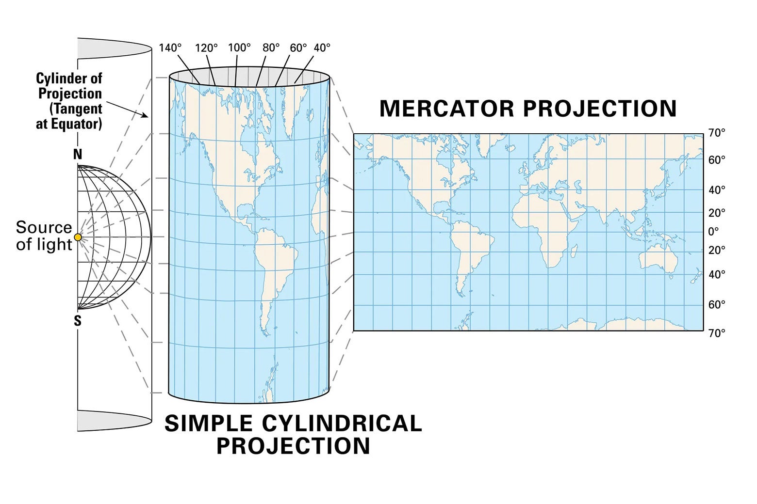
This is the context for the Mercator map, the one that shows Greenland looking like a hulking prize to Donald Trump. The Mercator was first introduced in 1569 by a Flemish geographer, and by the 1700s, it had become the default map. Today, it’s the map most commonly seen in much of the world. Here’s how it works.
Imagine a beachball version of the globe placed in a cylinder—an oversized toilet paper roll, if you will—with the equator gently resting against the inside of the cylinder so that the North and South poles point toward the two openings. Shine a light outward from the center of the beachball so that the ball’s surface is projected onto the inside of the cylinder. Doing so leaves the equator unmoved while the further each region is from the equator the more it gets stretched out. Now slice the cylinder open and unroll it to get a flat rectangular sheet. This is the Mercator map.
This map distorts areas, making landmasses that are far from the equator—hello, Greenland—look much larger than they really are. But it also has an amazing property: If two lines on the Earth’s surface meet at a right angle in reality, they will still do so on the map. For instance, latitudes and longitudes meet at right angles on the Earth’s surface, so they appear as a nice rectangular grid on the Mercator map. This has an extremely important consequence for navigation.
Before the days of GPS, sailors often charted nautical courses using what’s called a rhumb line. This is the path determined by choosing an angle and crossing all longitudes at this fixed angle. It’s relatively easy for sailors to maintain this course. The problem is that rhumb lines aren’t lines; they’re spirals that wind toward the North or South Pole.
This makes them very difficult to draw on a map … unless that map is the Mercator map. Then rhumb lines magically become lines. Charting a nautical course from point A to point B becomes as easy as drawing a straight line from A to B on the Mercator map.
Historically, most maps weren’t drawn to estimate the size of nations. They were drawn to help sailors navigate the globe. The Mercator map is arguably the best for this purpose, because it straightens out spiraling rhumb lines, and that’s why it rose to dominance. So that is how we ended up with a distorted picture of our planet in our classrooms, and in our minds—one that makes Greenland appear much larger than it is. Greenland is just over 800,000 square miles. The contiguous United States (the country’s lower 48 states) is nearly four times larger.
Over the years people have developed a whole zoo of alternatives to the Mercator map. None are perfect. They all get something right at the expense of getting something else wrong. Probably the most popular of the maps that do not distort size is the Gall-Peters map from 1855. It distorts shapes, but it gives a truer sense of size.
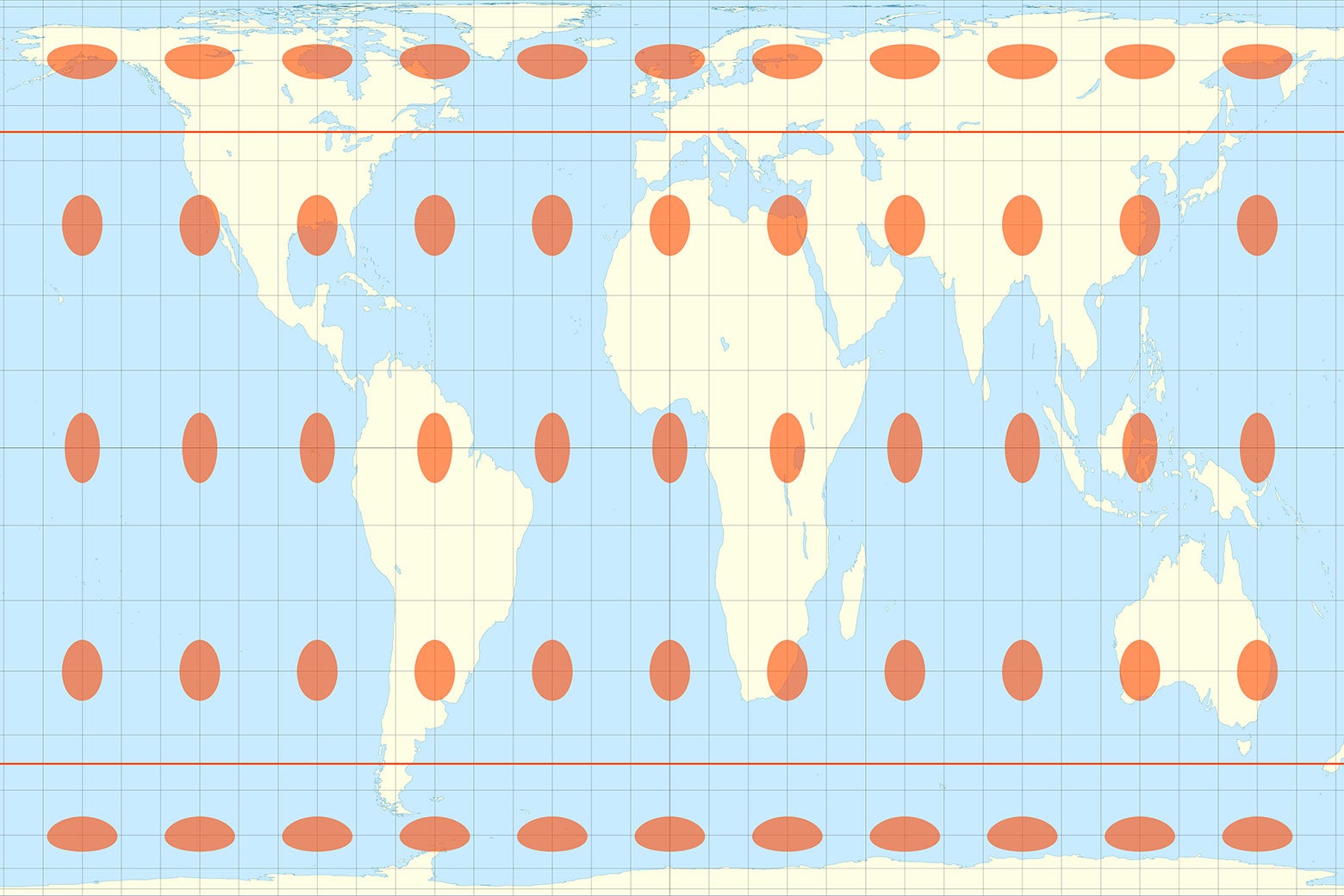
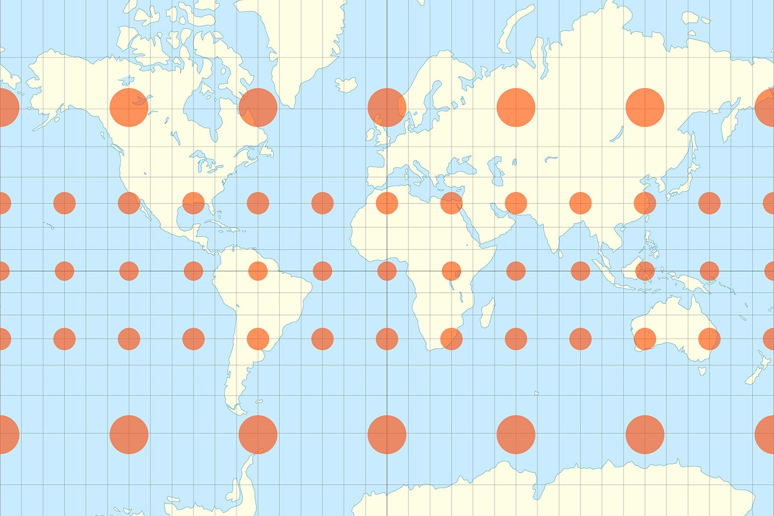
The orange ovals here show how a perfect circle on the globe is distorted depending on where it is located. Notice that this map stretches things out vertically near the equator and horizontally near the poles. Also notice that the true enormity of Africa comes across on this map. Compare this with the distortion pattern on the Mercator map, where circles stay circles but the sizes vary tremendously:
The area-preserving Gall-Peters map is widely used in British schools. It was adopted by Massachusetts schools in 2017 in an effort to provide students with a more accurate view of the world—one that doesn’t enlarge Europe and diminish Africa. Demonstrating that geographic accuracy isn’t just a liberal issue either: The governor of Nebraska in 2024 signed a law requiring the Gall-Peters map in his state’s schools. While the choice of map method sounds like a mathematical abstraction, it literally shapes the way billions of people see our world.
Only time will tell if President Trump follows through on his plan to take control of Greenland—and if he has buyer’s remorse upon realizing that it’s not as big as it looks on most maps.